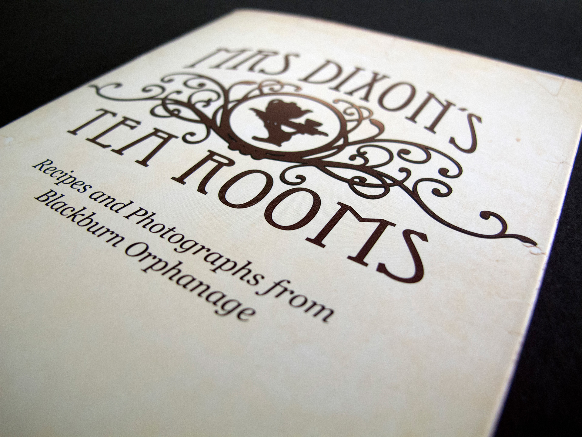
Mrs Dixon's Tea Rooms
The Background
At CANWe Solutions, clients often included charities, not-for-profits, and those with a link to social good.
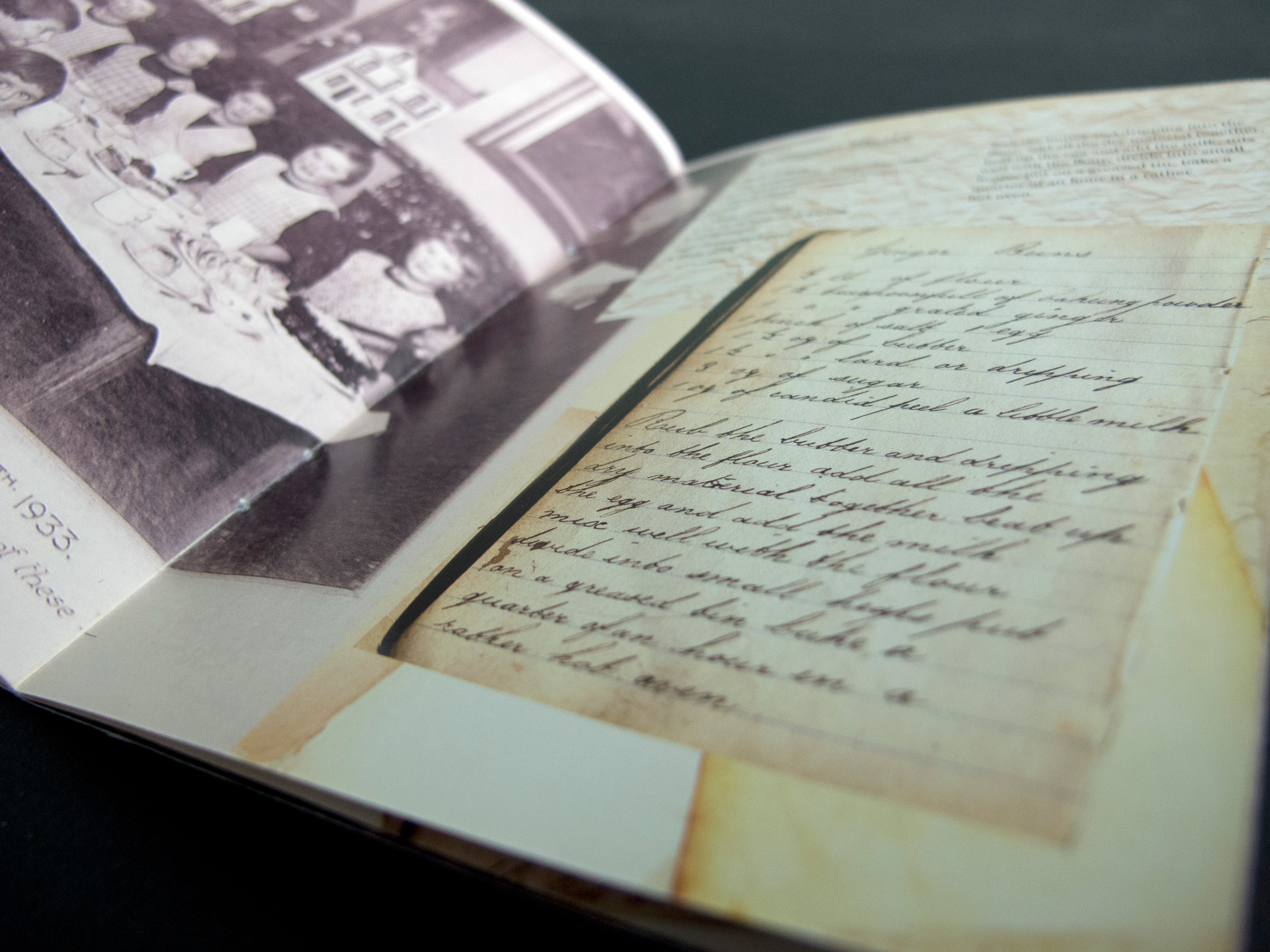
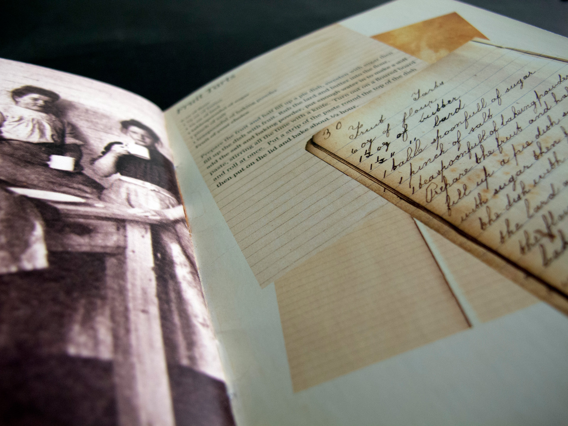
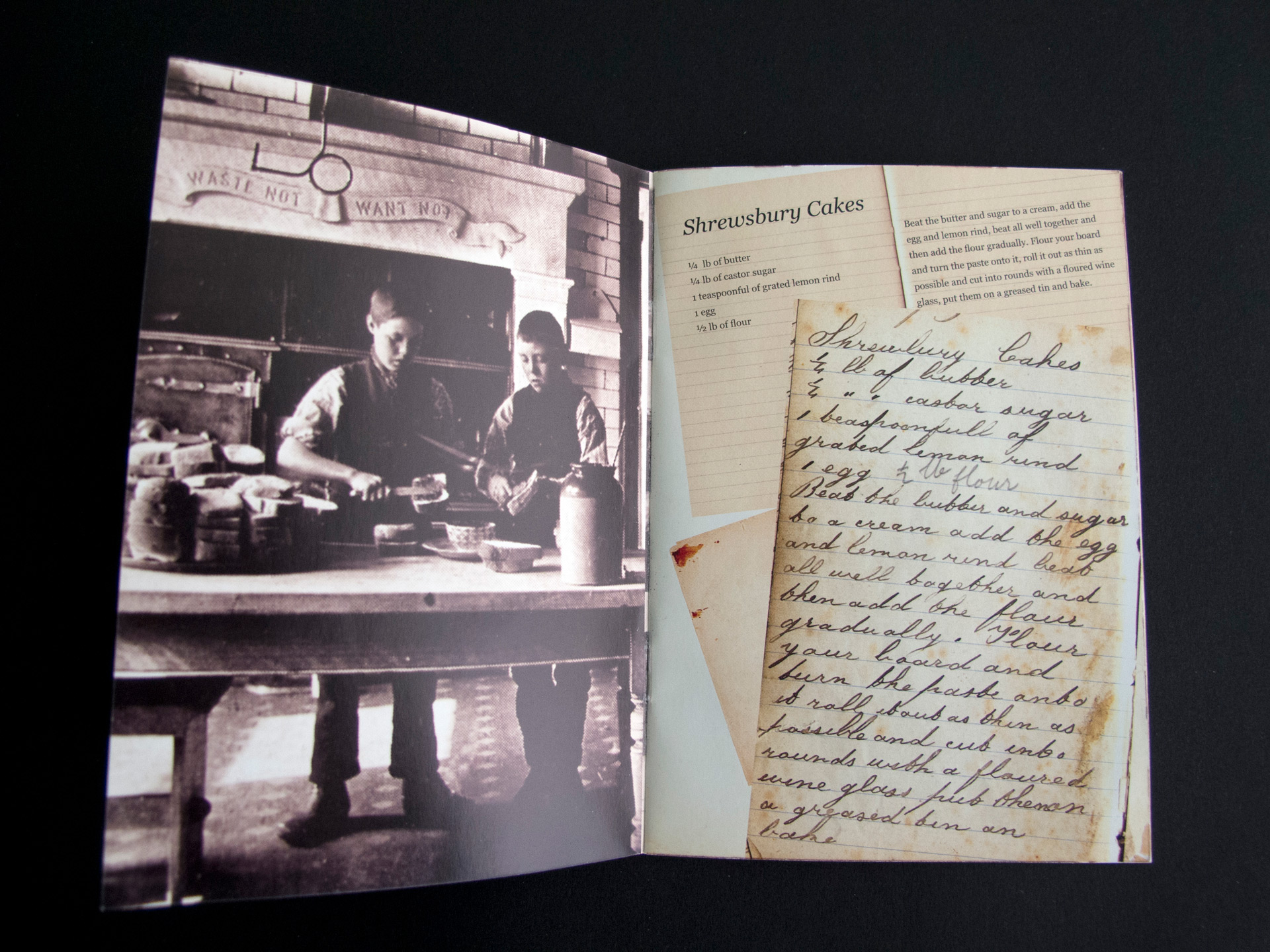
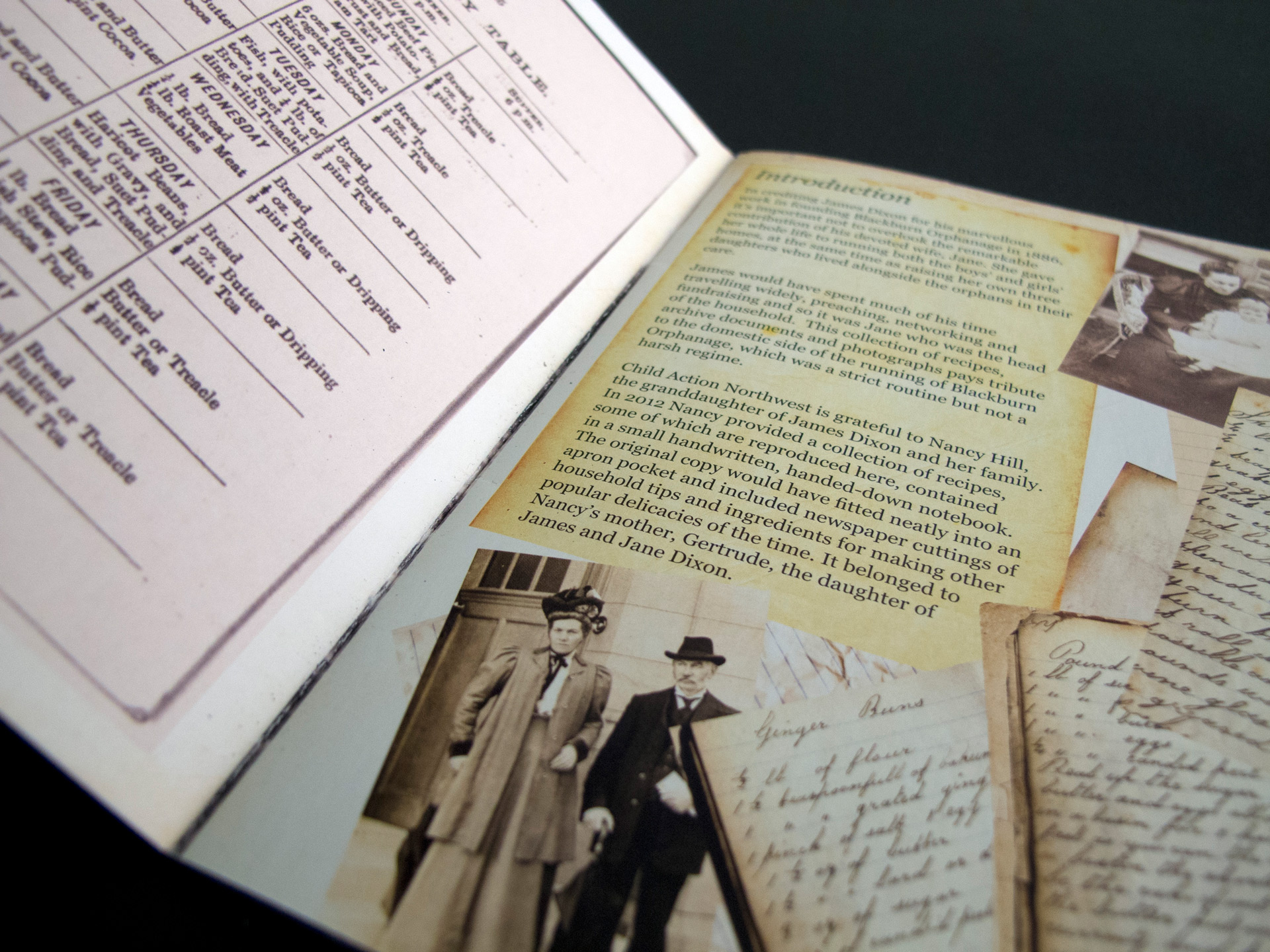
Child Action Northwest (CANW) had a number of initiatives to raise money and awareness. The CANW head office was formerly Blackburn Orphanage, and staff came across some old photographs and recipes from Mrs Dixon - one of the orphanage's founders.
The Response
The photographs and recipes were combined into a mini-brochure to be sold as part of a fundraising event.
As the fundraising event would have a vintage and Victorian theme, I created the recipe brochure in a collage style and used serif typography. The colour palette was minimal, combining natural sepia tones and monochrome together.